

[ad_1]
“Report back to me when, uh, I don’t know, when it makes sense.” —Burn After Reading
By Lambert Strether of Corrente
As readers know, I’m a humble Covid tape watcher. I don’t believe any of the numbers are as accurate as (say) an income statement [snort], but I have had confidence that I could discount the bullshit and at least form sufficiently useful narratives to answer questions like: Are we rising, peaking, or declining? Is my area safe? Is an area I want to travel to safe? If I get sick, what are the odds I won’t survive? For example, if Los Angeles County is a rapid riser county, it probably doesn’t make sense to fly there. And so forth. My motive is reader service (with myself as a reader). Now, however, I’m not so sure I can discount the bullshit properly, and that makes me queasy. And I’m not the only one:
In the wake of a flurry of warnings from officials over a potential COVID-19 resurgence in the United States, there are growing concerns among health experts that dwindling access to public data, the shuttering of COVID-19 testing sites and with an increasing number of people using at-home tests instead, it could leave the nation vulnerable to unforeseen upticks.
“Comprehensive case data is critical to an effective response. As we have seen throughout the pandemic, lack of data leads to poor decision making and ultimately costs lives,” Dr. John Brownstein, an epidemiologist at Boston Children’s Hospital and an ABC News contributor, said.
Worse, the CDC reform proposals seem geared to handing more power to an agency that has shown itself to be completely dysfunctional. Maybe clean house before starting a renovation?
First, I’ll quickly go through the metrics I’ve been using. (Readers are welcome to suggest new metrics, and new sources. However, I think continuity is also important. Plus, I’m aware of the new CDC dashboards, but I’m not sure their value-add goes beyond presentation, and in some cases the presentation is not that good.)
Case Count
Contra CDC and many Covid minimizers, I think case cases are the most important metric, more important than hospitalization. That’s because you can suffer vascular and neurological damage, or get Long Covid, without necessarily going to the hospital. In addition, case counts are much close to a leading indicator than hospitalization, and since Covid cases can multiply exponentially, getting as much lead time on a case explosion as possible is important. Here are the case counts for the last four weeks from the source I regularly use, 91-DIVOC:
This looks mightily and flatly reassuring (as long as you’re willing to accept that the new normal of average daily cases is equal to a record high in the first peak, in April 2020. But are these numbers right, and are the case count curves really flat? Probably not:
[Researchers] found the use of the [at-home] tests more than tripled when the omicron variant was spreading rapidly, increasing from an average of 5.7 percent to more than 20 percent among people with symptoms. While test use surged, the tests weren’t used consistently across the U.S. population — it varied by race, age, income or education. For example, the researchers found that white people were approximately twice as likely to report at-home test use, compared with those who identified as Black. In addition, adults in their 30s were more likely to report at-home test use than people in their teens and 20s and those ages 75 and older. At-home test use also increased with higher levels of household income and education — people making more than $150,000 a year and those with a postgraduate degree were the most likely to report the use of at-home tests.
At home tests aren’t likely to be counted:
“Home testing leads to marked underestimates of case numbers,” Dr. Robert Wachter, chair of UC San Francisco’s Department of Medicine, said in an email. “Clearly many hundreds of thousands of people are now diagnosing themselves with positive home tests (generally plus symptoms) and these are not reported.”
Even if you do try to report your results, the information isn’t likely to move the needle on the public’s understanding of the virus. That’s because they’re not included in the data health officials use to produce their reports and policies.
So the more people test themselves at home, the less the official numbers about new infections and positivity rates (that is, the percentage of tests that detect the virus) will provide an accurate picture of the public’s health.
So the case counts are bad. How bad? We don’t know. We did have an enormous Omicron peak. We are now not nearly at peak level. But where are we? We don’t know. It makes me queasy that we don’t have this simple, basic information. I have, however, collected a number of unsettling anecdotes. Perhaps readers can supply more.
Anecdotes
Note that all these cases are closed spaces, crowded places, and close contact. So as one would expect:
Film crews:
Everyone in the film&TV industry is regularly tested, some people three times a week. NYC film crews now seeing a surge in cases. We are the canaries. Trust me, wear your mask and avoid large indoor gatherings.
— thomas Jr. ? IATSE STRIKE! (@t_NYC) March 24, 2022
Game Developers Conference (GDC):
Ugh. Seeing the chatter about a lot of folks catching COVID at GDC this week is disheartening. Please do the right thing and notify the people you met closely with and use the appropriate contact tracing channels. There were a lot of maskless folks. ?
— Shawne Benson (@shawnethegirl) March 26, 2022
School:
A month after Vermont dropped masking in schools, 6/14 counties have medium or high transmission under the new CDC community levels. Universal school masking is needed now to ensure safe and stable in-person education for all. https://t.co/HrisYtwbLJ pic.twitter.com/ZB7KjVWg2w
— Anne Sosin (@asosin) March 26, 2022
(More on “community levels” later.)
Daycare center:
So a friend of mine’s toddler got Covid at daycare – diagnosed by PCR test. The whole family (one more young child and two parents) then all got symptoms. They just assumed they all had Covid – but didn’t go for tests so didn’t report it.
Anyone else hearing similar stories?
— Kate M (@ComissionerKate) March 27, 2022
And of course my perennial bugaboo, air travel:
Oh my god
Spoke to someone (not a patient) who got a flight back home from a European country last week KNOWINGLY with Covid?!!
Just because he didn’t wanted to isolate abroad.
So now EVERY SINGLE person on that flight has been exposed & at risk?!
?
— Neena Jha (@DrNeenaJha) March 26, 2022
Because freedom. Sure, those are just anecdotes. But there seem to be rather a lot of them.
Waste Water
As readers know, I’ve been very enthusiastic about wastewater detection, and the CDC stood up a National Wastewater Surveillance System. Unfortunately — hold onto your hats, here, folks — CDC seems to have butchered the data collection:
The federal government paid LuminUltra, a private commercial lab, more than $6 million to assist states that couldn’t monitor sewage on their own, but the company struggled to build trust with local operators who weren’t always aware of what the federal government was trying to accomplish. Mark McIntosh, the vice president of applied services at LuminUltra, said the CDC would have gotten more for its money if it had relied on local labs instead of a large, national company….. The hope was to build a system that could identify coming Covid case surges and detect new variants. And moving forward, it could pick out other public health threats, such as growing resistance to popular antibiotics, upticks in opioid use or the appearance of a virus that could cause the next pandemic. But 18 months since the effort began, only a dozen states — California, Colorado, Illinois, Missouri, North Carolina, New York, Ohio, Rhode Island, Texas, Utah, Virginia and Wisconsin — are routinely submitting data to NWSS, according to the CDC. Even then, the information from some of those states is thin. California, which has 39 million people, has 23 collection sites on the CDC’s NWSS dashboard, most of them clustered in the Bay Area. More than half of New York’s nearly 60 sampling sites have no recent data on the dashboard, meaning the CDC doesn’t have at least two data points from the last 15 days to calculate a percentage change in viral concentration…. CDC officials believe a wastewater surveillance system can work even if all states do not participate, noting that it is designed to supplement other public health surveillance efforts — . “Having more sites sampling wastewater allows for a more robust national surveillance system, but we know that one of the biggest advantages of NWSS is that it gives local health officials specific, actionable information about what’s happening in their community so that they can take steps to protect the public’s health, if needed,” a CDC spokesperson said.
What a horrid example of handwaving and excuse-making from the CDC spokeshole. The system is called “National.” That’s a lie; it’s not. And that’s somehow good?
Worse, CDC butchered the dashboard it built:
8/ This pattern, where the CDC dashboard (below) indicates dramatically rising viral concentration but the state-level data do not, is happening in sampling sites across the country. pic.twitter.com/5Rs6I0s1cO
— Pandemic Prevention Institute (@PPI_Insights) March 16, 2022
First, why the discrepancy between state data and CDC’s dashboard, when the CDC’s data is supposedly derived from the state? Second, a 1000% increase isn’t especially useful, unless I know the baseline.
Hospitalization
Hospitalization — central to CDC’s horrid “community levels” metric — would seem to be relatively straightforward. After all, billing is involved. Sadly, no:
Hospital trick: patients admitted with covid in 10-12 days become post-covid & no longer counted as hospitalized covid patients. ICU is full of post-covid patients that are here for 30, 40, 50 & more days. Not counted in the official stats.
— Dr. Natalia ?? (@SolNataMD) January 24, 2022
Commumity Levels
We reviewed CDC’s new community levels metric — which I shall not be using — at NC here:
The formula is stupid. The message conveyed by the “Low” (Green) level is low risk. To move the community level from Low to Medium (“Yellow”) risk, the load on hospitals must increase. But hospitalization is a lagging indicator. So there will be a window for Covid to spread while infection is increasing, but hospitaliation is not, while the level remains Green. In that window, people will not be encouraged to mask up, no community measures will be taken, and so on. Note again that people can catch Covid, avoid hospitalization, and still come down with Long Covid later. As one primary care doctor remarks:
… both justifying the relaxation of public health protections now and about justifying too little, too late policy responses in the future when surges re-emerge.
— Andrew Goldstein #EndVaccineApartheid (@AndrewMakeTweet) February 25, 2022
Personally, I’d stick with case numbers, underestimated though they are, rather than CDC’s new formula. It’s almost as if…. It’s almost as if…. CDC wants you to get sick.
Worse, CDC butchered the data when implementing its “Community Levels” metric in California:
Federal health officials who reported that nearly half of Californians live in “high-risk” counties for COVID-19 were relying on old data, and only a small number of counties now fall into that category, according to local officials.
At stake is whether counties considered high risk should keep indoor masking requirements under new guidance from the U.S. Centers for Disease Control and Prevention or follow the state’s lead in removing nearly all mask requirements..
Kamlesh Kaur, a spokesperson for the Stanislaus County Department of Public Health, said the county was surprised to be designated high risk by the CDC. The most recent COVID-19 case rate for Stanislaus County is about 13 times lower than what the CDC reported on Friday, she said.
The CDC’s estimates appear to be outdated by more than a month.
“I’m not sure when (the CDC) received their data. They are showing a little over 200 cases per 100,000 residents. Right now our cases are at 18.2 per 100,000 residents,” she said.
Deaths
From the Guardian:
Last week, after reporting from the Guardian on mortality rates among children, the CDC corrected a “coding logic error” that had inadvertently added more than 72,000 Covid deaths of all ages to the data tracker, one of the most publicly accessible sources for Covid data.
The agency briefly noted the change in a footnote, although the note did not explain how the error occurred or how long it was in effect.
About that footnote:
Here is the footnote (you have to scroll to the bottom of the page and then open an accordion). I have helpfully highlighted the relevant portion:
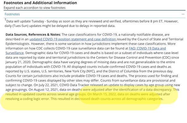
The Guardian continues:
The problem stemmed from two questions the CDC asks of states and jurisdictions when they report fatalities, according to a source familiar with the issue.
One data field asks if a person died “from illness/complications of illness,” and the field next to this asks for the date of death. When the answer is yes, then the date of death should be provided.
But a problem apparently arose if a respondent included the date of death in this field even when the answer was “no” or “unknown”. The CDC’s system assumed that if a date was provided, then the “no” or “unknown” answer was an error, and the system switched the answer to “yes”.
This resulted in an overcount of deaths due to Covid in the demographic breakdown, and the error, once discovered, was corrected last week. The CDC did not answer a question on how long the coding error was in effect
Readers may wish to comment on the CDC’s coding style. Of course, what do a few tens ot thousands of deaths matter, when there are so many? However, when a coding shop commits errors like that one, you can be sure there are others just like it.
Excess Deaths
David Wallace-Wells writes on the importance of a “single metric.” That metric is excess deaths:
There is one data point that might serve as an exceptional interpretative tool, one that blinks bright through all that narrative fog: excess mortality. The idea is simple: You look at the recent past to find an average for how many people die in a given country in a typical year, count the number of people who died during the pandemic years, and subtract one from the other.
As a measure of pandemic brutality, excess mortality has its limitations — but probably fewer than the conventional data we’ve used for the last two years.
And to the extent that the ultimate impact of the pandemic isn’t just a story about COVID-19 but also one about our responses to it — lockdowns and unemployment, suspended medical care and higher rates of alcoholism and automobile accidents — excess mortality accounts for all that, too. In some places, like the U.S., excess-mortality figures are close to the official COVID data — among other things, a tribute to our medical surveillance systems.
Could there be “coding errors” in the CDC’s calcuations for excess deaths? We don’t know. One thing we do know, and I’ve been irritated about this for months:
Look at the qualifications in that drop-down. And the ginormous typo, helpfully highlighted….
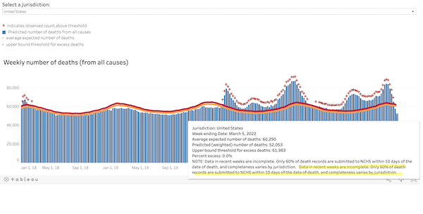
We know that CDC’s copy editing processes are slow. But this error has been present as long as I’ve been running that chart. To me, that’s a sign that nobody at CDC is looking at the excess deaths chart at all. Does that mean they’re not looking at the algorithm?
Conclusion
FiveThirtyEight reviews the history of various datatypes as they came into salience. They conclude:
For two years we’ve tried to make sense of COVID-19 trends with metrics that were fundamentally impaired by our chronically decentralized and underfunded public health system. Looking back, it’s remarkable how poorly we started, how far we’ve come and how far we still have to go. If the country doesn’t want to repeat its mistakes, it will have to take radically different actions the next time a health crisis hits.
The great and the good of public health, including Ezekiel Emmanuel — with a little help from The Blob — put together a report that proposes many such actions. Here, from “Getting to and Sustainin the Next Normal: A Roadmap for Living with COVID,” are the “Health Data Infrastructure Strategic Goals:
1. Empower and fund the CDC to rapidly develop standardized, national, real-time, comprehensive, and secure data platform(s) to monitor respiratory viruses and illnesse
2. Direct HHS to establish consistent national data standards by identifying critical metrics, defining them clearly, and establishing collection, linkage, and reporting requirements.
3. Direct HHS to financially incentivize or require real-time reporting from states, localities, health providers and at-home testtakers, to include secure and de-identified test results, vaccination status, vaccine breakthrough and re-infection status, , job, workplace, and other essential socio-demographic information.
Lol, income is not on the list? Roll on, neoliberalism!
4. Direct and fund the CDC to accelerate insight generation and provide .
5. Direct HHS and the CDC to design health infrastructure to promote health equity and mitigate racial, ethnic, occupational and gender disparities.
I have to question whether CDC — at least without a thorough housecleaning that would involve gutting the management team after forcing them to testify before Congress or, better, The Hague — is institutionally capable of achieving any of these goals, but that is a topic to go into later. However, I do want to call out something that Emanuel and crew got right. I underlined it: “Open access.” The data behind the dashboards should be open and accessible to all (and not just to hospitals or professionals). Another crew of the great and the good, writing in the Hill, has a terrific metaphor for how such a system should work:
The National Weather Service relies on a decentralized network of satellites, radar sites and local data to model and predict severe weather events. Their authority to do this does not flip on once a storm begins. Storm trackers are always on the lookout with coordinated streams of real-time data that are consolidated, analyzed and publicly shared, enabling them to alert communities and save lives. In contrast, the CDC has had to rely on uncoordinated data agreements because the agency lacks the legal authority to systematically ensure public health reporting before a health threat strikes. We wouldn’t attempt to predict severe weather like this, so why do we try to forecast the spread of deadly diseases this way?
The key is not only that the data be open, but that it would be interoperable (unlike, say, fifty states reporting data in fifty different ways (as Cory Doctorow suggests for the platforms). if the data were interoperable, citizen scientists could go to work on it, app developers could code to it, data reporters could dive into it, and so on. Much more powerful than CDC going into the dashboard business. Let a million dashboards bloom!

[ad_2]
Source link